After5
Design a modern and growth-focused experience of After5 app, building female friendships across Europe, for connections in real life, without swiping.
Overview
After5 is a friendship-building app, connecting women in European cities, with a 5,000 user base in 5 countries, including UK. My goal was to build a modern foundation and redesign entire flows with fundamental usability principles to help users understand how to use these unique services along the way.
I was the sole UX & UI designer to create the design system, user flows, and all screens for the iOS experience. I've completed the design system and four core flows—Onboarding, Alike, Chats, and Notifications—that now serve as the foundation for continued product development, launching in Q1 2026.
Client
Responsibilities
UX Audit
Design System Building
UX & UI Design
Brief
Build a iOS app from the ground up to support women to build meaningful friendships in-real-life through curated connections.
Year
2025
Duration
2 months | Part-time
My Team
Product Owner who is advising co-founders.
Impact
Nazlı understood what we were building and translated that into clean, intuitive and use-centered designs. She's creative, collaborative, and incredibly easy to work with.
Nina de Graaf, After5 Co-founder
Our app is being transformed from ground up with intuitive and visually engaging designs, significantly enhancing the user experience. Nazlı's creativity, high-quality work, and attention to detail exceeded our expectations.
Sıla Uygun Fidan, After5 Co-founder
Nazlı quickly internalized our product vision and the problems we aim to solve, making collaboration and decision-making genuinely effortless. Her ability to navigate tricky contexts throughout a complex service journey and design-system process made this redesign smooth and impactful.
Mert Erbil, After5 Product Advisor
Challenge
After5's app had severe UX issues that was blocking a lot of users to not complete their purchases in the app, which required After5 team's individually correcting every user issue manually via e-mails and mostly directing to their website for end-to-end purchases.
Their current app reflected an outdated aesthetic, and users struggled to understand their core services: Alike (personalized 1:1 matches), A Table (curated group gatherings), and An Edit (exclusive themed events).

Puzzling flows for each service reduced user perceptions on how to use them.
Alike, A Table, and An Edit each had different purchase flows, and even existing users found them confusing. I prioritized Alike because it had the most perplexing flow: lengthy forms with unclear matching questions, confusing purchase terminology, complicated date-setting, and no explanations for edge cases like non-responsive matches.
Fundamental usability issues blocked growth.
Onboarding lacked value-based messaging and actionable steps, making confused users bail before signing up. Unclear service explanations and distinctions meant users only tried one feature instead of exploring all three. Cumbersome purchase flows and jargon created abandonment at the critical conversion moments. And along the way, app screens didn't convey next steps and missed cross-sell opportunities across 3 services.
App's visual language distracted from our mission.
3 types of typography, a bare-bones component library, and unclear hierarchy made it hard to convey how the three services worked together. Shades of warm-toned orange reflected a more antiquated tone-of-voice, type choices were used with different hierarchies across the platform, large images were distracting from the app's purpose and overall reflecting a more editorial tone rather than a service-app.


Design System
My first step was dissecting the existing design system and building a new one aligned with After5's web and social media. I intentionally kept it as a facelift rather than a rebrand, updating colors and typography for consistency.
I introduced Figtree for improved legibility, replacing Inter-Garamond mix. For editorial headlines, I added STIX Two Text. I built a type scale with 13 size variations, each with optimized line heights and tracking.
Co-founders wanted to replace orange with pink to match their social media direction. I used pink as the primary accent for interactive elements and CTAs exclusively, balancing with Stone neutrals for a warm foundation with product-look-and-feel.
Using this visual facelift, I designed an extensive component library with buttons (all states), chips, entry items, list items, dropdowns, and accordions. Everything was documented with usage guidelines and I regularly update it with newer additions where required.
Design of Alike Flow
The biggest challenge was users not understanding what they were buying or what would happen after purchase. The original flow jumped from profile to payment without explaining the matching process, leaving users anxious about spending €12.
I redesigned the journey to build confidence at every step, and shorten the flow to ensure frictionless meetups.
Dynamic homepages that show progress at every step.
The static homepage confused users on their Alike progress. I designed step-specific versions, and coupled each step with targeted CTAs. Now users always know where they are and what comes next.


Trusting users to coordinate their own meetups.
Chats were disabled until both users logged calendar availability — creating friction and reducing meetup rates. I convinced my client to strategically remove scheduling and enabled chats upon matching. Users will now coordinate organically without delay, eventually reducing manual involvement efforts from After5 team.
Edge cases addressed beforehand, keeping users in app's ecosystem.
Currently, the app leaves users in abyss when matches take too long or connections don't respond, without explanation and options. While highlighting their steps in the progress indicator, I added prompts for each scenario to engage them with After5's other services.

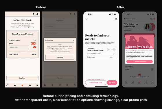
Transparent pricing will build purchase confidence.
The old dark flow hid costs and mixed confusing jargon with matches, credits, and subscriptions. I redesigned with clear pricing, visible subscription savings, and instant promo code feedback.
Design of Chats
The original chat treated all conversations the same—no context about who users were talking to or why. For Alike matches, this was a problem. Users felt awkward starting conversations without guidance and didn't know how to suggest meeting up. Blank chat screens created anxiety instead of excitement.
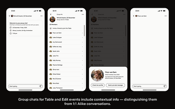
I redesigned chats to give context for each type. Alike chats open with "It's time to meet your match! Most successful connections meet within 2 weeks." I added cafe recommendations with venue cards directly in chat for easy coordination. For Table and Edit groups, headers show event details (date, location, time) and participant lists. Smart notifications keep users engaged without overwhelming them.
Next Steps
We are currently collaborating on designing further flows for A Table, Edit and other critical fundamental parts of the experience.
The iOS app is being planned to launch on Q1 2026.